
In 2020, it seems like every single person with a creative idea is out to build their own stunning website.
Squarespace’s “Make it Real” campaign amplifies the idea that creating websites with drop-dead aesthetics is not only possible, it’s easy; it’s not time-consuming. And it starts at $12 per month.
But while website builders like Squarespace do make website creation and design seem simple and convenient, they don’t necessarily help you develop an eye for tasteful design.
And although they offer a boat-load of templates for you to try out, none of them will feel as tailored as a website you design yourself.
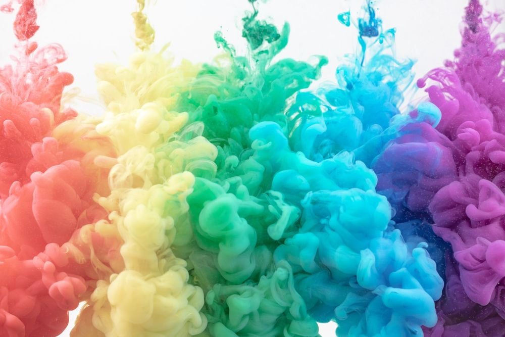
Many elements go into great website design, but among the core pillars are the principles related to color schemes. Indeed, if your aim is to stand out from the plethora of websites created with cookie-cutter templates, you must be unique in your choice of colors.
This is not just about making a website that gets people to think, “Oh, that looks beautiful.” This endeavor is far more pragmatic.
In a study called, “Impact of color on marketing” it was reported that anywhere up to 90 percent of a person’s opinion about your website (and it’s products) is based solely on the site’s color scheme.
This means that, if you’re selling products on your site, you might miss out on a lot of money just because you chose the wrong colors.
And if your website doesn’t sell products, having the wrong colors could still leave your visitors feeling little connection to your site, which isn’t good for your website performance metrics.
To avoid these negative outcomes, it’s a good idea to start becoming familiar with how colors impact your website. You can begin that journey today as we spend the rest of this article talking about three basic concepts related to creating your website’s color schemes.
Concept One: Understand Color Combinations
 When you see a color, you get a feeling. Blues tend to remind people of calm. Red can invoke feelings of anger or passion. And green, for obvious reasons, brings feelings of tranquility and a reminder of nature.
In the same way that each individual color has its own significance and meaning, every color combination builds upon those feelings in tandem.
The combination of different colors on your website communicates a message to visitors. When you use a Complimetary color scheme, such as a red and blue color scheme, the message you create is a mixture of both colors’ meaning.
And that’s just two colors. When you mix three colors together that are close together on the color wheel, the scheme becomes Analogous. When you use three colors that are equally spaced apart on the color wheel, you get a Triadic scheme.
Need a refresh on what the color wheel is? Look no further than our next section.
Concept Two: Understand the Color Wheel
 To help understand how to properly utilize color combinations, it’s useful to understand some of the fundamental ideas behind color theory.
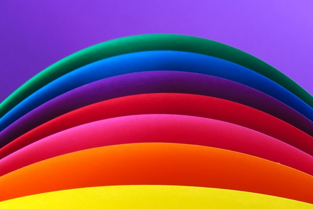
The colors that are on the color wheel can be split into three groups: primary, secondary, and tertiary.
In the first group, you have red, blue, and yellow. When you mix any of the primary colors together, you get the secondary colors of orange, green, and purple.
And when you spice things up even more by mixing the primary and secondary colors, you get blue-purple, yellow-green, and red-orange.
It’s from the foundation of these three groups that color schemes arise.
Rule Three: Understand Color Psychology
 As we talked about early in the article, different colors evoke different feelings, and if modern advertising research has taught us anything, it’s that feelings can, undeniably, compel different actions and behaviors.
When you’re considering your website’s color scheme, think hard about what kind of experience you’re trying to deliver to the visitor. What’s the first emotion you want them to feel when they discover your site? Joy? Concern? Excitement? Intrigue?
What about each webpage? Will the color design help lead your customers to a state of considering purchase? Or are you trying to garner their support for a passion project?
These are the questions you need to be asking if you want to deliver an effective curated experience for your future visitors. In order to think about these questions properly, you have to understand the psychology behind your arsenal of colors.
Why Color Matters
 By now, you should have a good understanding of some basic concepts related to website color schemes. As you were reading this article, you might have had a particular question come to mind: why are colors so important to us?
It’s a good question, and one that has been taken seriously by people within the scientific community for a while now.
There’s a lot of important scientific literature you’d have to go through to get a comprehensive understanding of this phenomenon, but in short, it has to do with how we evolved.
There’s a reason why the color red shows up so frequently in product design (think budweiser. Coca-Cola, Prada’s res stripe, etc).
It has to do, in part, with how we evolved to see ripe fruit (often the color red) and the rush of blood to people’s faces (blushing). Being able to see these things was pivitol to the development of our species.
So next time you look at a website’s color design, think about how it makes you feel. Consider why it might make you feel the way you do? Pay special attention to the site’s that compel you to visit a purchase page, because if you get there, it means they’re doing something right.
As you begin applying these lessons to your own website design, keep in mind that your first attempts at creating a great looking color scheme might not turn out perfect—and that’s OK. Never let “perfect” be the enemy of “good.”